DBAs spend time dealing with SQL Server performance, capacity, monitoring, troubleshooting, provisioning, etcetera; I’ve previously mentioned that R is a powerful, open-source language with a great ecosystem of libraries for analysis and visualisation, so it’s no surprise that I think mixing SQL Server and R Markdown for reporting goes together like a Vegemite and cheese sandwich…lunch perfection!
Here’s a couple of real-world examples of how I’ve used R Markdown connected to SQL Server (for a recap of how to do this from a technical perspective, see my earlier blog post “Connecting to a SQL Server database from R Markdown”):
- SSIS error report from log records in the SSISDB database
- Reporting Services reports from the ReportServer database - reports with schedules, execution history, folders & reports with non-parent permissions etc.
- database data & log file size history, backup size history, SQL Agent job history, database inventory (really anything from the list in my automated DBA monitoring post that can supplement other monitoring)
- data from third-party scripts such as sp_Blitz, sp_WhoIsActive, or Ola Hallengren’s backup and integrity checks
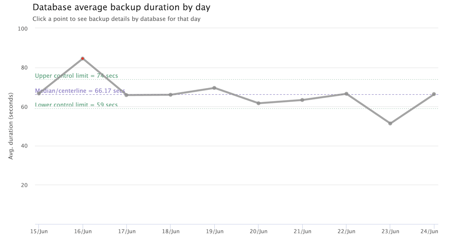
I’m going to look at the last one today, charting average full database backup durations from Ola Hallengren’s CommandLog table to see if outliers could be identified that may warrant further investigation:
To run R Markdown, you’ll need R and RStudio, or a Shiny Server, or Docker as I wrote about at “Dockerizing R Markdown/Shiny”.
As a DBA, why consider R Markdown for reports and dashboards? In addition to the wide variety of ready made - and free - libraries, one of the key advantages of Markdown is it’s just code i.e. text files. This makes sharing and versioning a lot simpler. Compared to the highly capable visualisation libraries like ggplot, Plotly, and Highcharter in R, the charts in Reporting Services are severely lacking. What’s more, developer mindshare has clearly left - there’s no cool new blog articles, chart types are old and static, and people have moved on to alternatives like Power BI, Python, R, Tableau etc.
It’s not going to be possible to demonstrate connecting to a “live” SQL Server, so instead I’ll simulate database full backup times similar to those recorded in Ola Hallengren’s CommandLog table. I’ll chart average backup times by day which might identify slower days, showing details for the day when clicking on a chart point. All this in an interactive single R Markdown file.
Why would I be interested in how long full database backups take? It might help point to contention with storage, unusual database growth, adding a new database to a server, or other activity. I’d want to know if this happens repeatedly or is a once-off. I also don’t want to hard-code a threshold to investigate (e.g. “backups were 5 minutes longer than usual” or “5% longer than usual”), so I’ll look for a way to tackle this.
Setting up the environment
Before starting, make sure of an up-to-date version of R and RStudio installed, along with following R packages: DT, dplyr, highcharter, glue, lubridate, and purrr (plus DBI and odbc for database connectivity).
You can get the complete code from my repo at https://github.com/thomasswilliams/r-markdown-DBA/blob/main/DBA-backup-durations.Rmd.
The first section fakes 10 days worth of full database backup times for a server in a data frame df (I won’t go over that here).
The next section takes the data frame, calculates some stats, and charts the average full backup duration per day as a psuedo-statistical control chart with median and upper/lower limits. Here’s the code:
# create a new, summary, dataset based on the average elapsed seconds per day
# calculate the median, sigma and upper and lower "control" limits
# display in a Highchart chart
# adapted in part from https://norbertocioffi.medium.com/shewhart-control-charts-with-r-f62a3359a4a1

# placeholder for highchart
highcharter::highchartOutput("summary_chart", height = "500px")

# render highchart
output$summary_chart <- highcharter::renderHighchart({

  # create new summary data frame from df: date (no time), average_elapsed_seconds
  df_summary <- df %>%
    # get date, no time
    dplyr::mutate(date = as.Date(StartTime)) %>%
    # group by date
    dplyr::group_by(date) %>%
    # average elapsed seconds per day (ignore DatabaseName)
    dplyr::summarise(
      average_elapsed_seconds = mean(elapsed_seconds),
      # drop fields not explicitly named here
      .groups = "drop"
    ) %>%
    # order by date (necessary for chart)
    dplyr::arrange(date)

  # calculate limits using Median Absolute Deviation (MAD) method
  center <- median(df_summary$average_elapsed_seconds)
  # calculate sigma using MAD, multiplied by constant to make comparable to standard deviation for normal distribution
  sigma <- mad(df_summary$average_elapsed_seconds, constant = 1.4826)
  # Upper Control Limit, rounded to nearest whole second three sigma above the center/median
  ucl <- round(center + 3L * sigma)
  # Lower Control Limit, rounded to nearest whole second
  lcl <- round(center - 3L * sigma)
  # reset LCL to zero if lower than zero (duration in seconds cannot be *less* than zero)
  lcl <- max(lcl, 0L)

  # add coloring for if plot points are outliers (only for above upper range)
  # red for out of range, transparent for in range
  df_summary <- df_summary %>%
    dplyr::mutate(
      point_color = ifelse(average_elapsed_seconds > ucl, "red", "transparent")
    )
  # new field "ts", convert date to JS timestamp
  df_summary <- df_summary %>%
    dplyr::mutate(ts = highcharter::datetime_to_timestamp(date))

  # output the chart
  highcharter::highchart() %>%
    # line chart
    highcharter::hc_chart(type = "line") %>%
    # title
    highcharter::hc_title(
      text = "Database average backup duration by day",
      align = "left",
      x = 55L
    ) %>%
    highcharter::hc_subtitle(
      text = "Click a point to see backup details by database for that day",
      align = "left",
      x = 55L
    ) %>%
    # axis labels
    # x axis is date, formatted as day/month (e.g. 1/Jan)
    highcharter::hc_xAxis(
      type = "datetime",
      labels = list(format = "{value:%e/%b}")
    ) %>%
    # y axis is average duration in seconds
    highcharter::hc_yAxis(
      title = list(text = "Avg. duration (seconds)"),
      # format with thousands separator and no decimal places
      labels = list(format = "{value:,.0f}"),
      # on y axis, add dotted green lines for UCL and LCL, and dashed purple line for center/median
      # left-aligned labels in same colors
      plotLines = list(
        list(value = ucl, color = "#3EA57B", width = 1L, dashStyle = "Dot", opacity = 0.6, label = list(text = paste0("Upper control limit = ", ucl, " secs"), align = "left", x = 0L, style = list(color = "#3EA57B"))),
        list(value = lcl, color = "#3EA57B", width = 1L, dashStyle = "Dot", opacity = 0.6, label = list(text = paste0("Lower control limit = ", lcl, " secs"), align = "left", x = 0L, style = list(color = "#3EA57B"))),
        list(value = center, color = "#9481CC", width = 1L, dashStyle = "Dash", opacity = 0.6, label = list(text = paste0("Median/centerline = ", round(center, 2L), " secs"), align = "left", x = 0L, style = list(color = "#9481CC")))
      ),
      # set y axis to start at zero, and hide the zero label (as it's obvious from the axis)
      # start at zero
      min = 0L,
      # don't display the zero label
      showFirstLabel = FALSE
    ) %>%
    # custom tooltip
    highcharter::hc_tooltip(
      useHTML = TRUE,
      formatter = JS("
        function() {
          return '<b>Date:</b> ' + Highcharts.dateFormat('%e/%b/%Y', this.x) + '<br>' +
                 '<b>Avg. duration:</b> ' + Highcharts.numberFormat(this.y, 0) + ' seconds';
        }
      ")
    ) %>%
    # line series
    highcharter::hc_add_series(
      name = "Average duration",
      data = purrr::map2(
        # map timestamp to x, and elapsed seconds to y
        df_summary$ts,
        df_summary$average_elapsed_seconds,
        # output a list
        ~list(x = .x, y = .y)
      ),
      # heavy line
      lineWidth = 4L,
      color = "#8f8f8f",
      opacity = 0.8
    ) %>%
    # points
    highcharter::hc_add_series(
      name = "Points",
      type = "scatter",
      data = purrr::pmap(
        # map timestamp to x, elapsed seconds to y, and color
        list(df_summary$ts, df_summary$average_elapsed_seconds, df_summary$point_color),
        # set color based on if above UCL (red) or not
        function(x, y, col) {
          # output a list
          list(x = x, y = y, color = col)
        }
      ),
      # slightly larger point
      marker = list(radius = 3L)
    ) %>%
    # disable the legend (as only one series, points are colored by if above UCL or not, legend not needed)
    highcharter::hc_legend(
      enabled = FALSE
    ) %>%
    # for clicks on a point, set "selected_date" to the date of the clicked point
    # (converted from JS timestamp to R date)
    highcharter::hc_plotOptions(
      series = list(
        cursor = "pointer",
        point = list(
          events = list(
            # set selected date on click, convert from JS timestamp to R date in format YYYY-MM-DD
            # set the input value input$selected_date, which triggers a change to selected_date_outer$date
            click = JS("function() { Shiny.setInputValue('selected_date', new Date(this.x).toISOString().slice(0,10), { priority: 'event' }); }") # nolint: line_len
          )
        )
      )
    )
})
I’ve commented the code liberally, but if this is your first time looking at R Markdown, here’s a couple of hints to reading:
- ”#” starts a comment
- ”%>%” pipes one statement to another
- ”<-“ is assignment
- passing a list (needed for some
highchartercalls) is explicit with “list” e.g.list(x = x, y = y, color = col) - functions can be prefaced by their library for disambiguation e.g.
highcharter::highchartOutput - fields in a data frame retrieved from a database with
odbcare strongly-typed e.g. dates are POSIXct, strings are characters, numbers are numbers etc. - R can operate efficiently on sets of data without looping - the following sets a variable “center” to the median value of the field “average_elapsed_seconds” in the data frame:
center <- median(df_summary$average_elapsed_seconds)
The last section in the R Markdown file is the detail table, shown only when clicking on a date in the chart. See the R Markdown file for code - it’s pretty straightforward, filtering the data frame df for the selected_date_outer$date date, and displaying full database backups for that date.
Running the R Markdown file gets interactive HTML output - tooltip hovering on points in the chart, clicking a point in the chart, table sorting. It’s worth noting how little R code it takes to get a data frame to an interactive table (I embellish with extra formatting).
This is a start on what’s possible using R Markdown. I’ve left some suggestions for “production-ready” upgrades in the R Markdown file. You can find the full code in my new DBA R Markdown repository on GitHub at https://github.com/thomasswilliams/r-markdown-DBA.