I enjoy using data, and nothing makes data stand out like a chart.
Recently I wanted to better understand my home energy usage. First I created a CSV file from data from my power provider, with 4 fields: month in “YYYYMMDD” format, total peak kWh usage for month, off-peak kWh, and solar feed-in kWh. For some months I didn’t have solar feed-in data, so the first 12 values for that field are blank. Here’s a snip of the somewhat boring data, which spans from January 2022 to September 2025:
(The whole “solar-analysis.csv” file is at https://github.com/thomasswilliams/r-solar-dygraph/blob/main/solar-analysis.csv.)
month,peak,off_peak,solar_feed_in
20220101,246,608,
20220201,236,474,
20220301,295,435,
20220401,339,598,
...
I also wanted to get a little interactive with my analysis, and came across Dygraphs for R https://rstudio.github.io/dygraphs/ which wraps the “venerable” (according to creator Dan Vanderkam https://github.com/danvk) javascript charting library of the same name, first released in 2006.
I used Dygraphs in an R script file (it can work equally well in R Markdown) to quickly chart my time series data, loaded from the CSV file. Dygraphs were simple to use, are a solid pick among other charting libraries and very functional for being free and open source. With a single line of code, I got a decent initial chart:
# file_xts is time  series data of the CSV file
dygraphs::dygraph(file_xts)
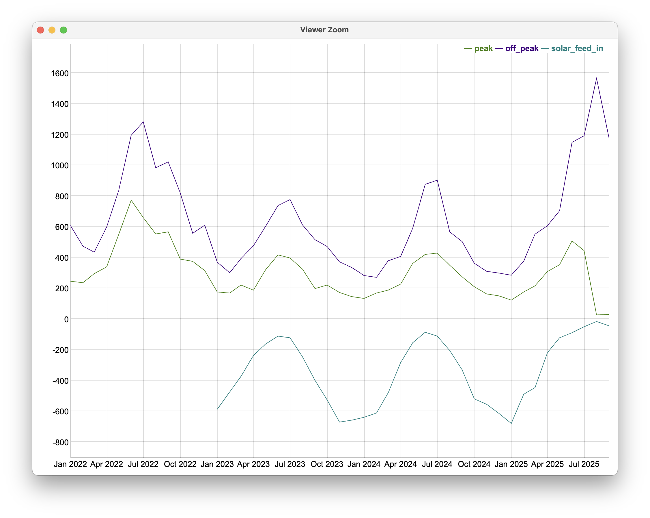
Of course, the chart is more than the screenshot above - for instance, hovering updates the tooltip with the current month’s values, and the chart can be zoomed.
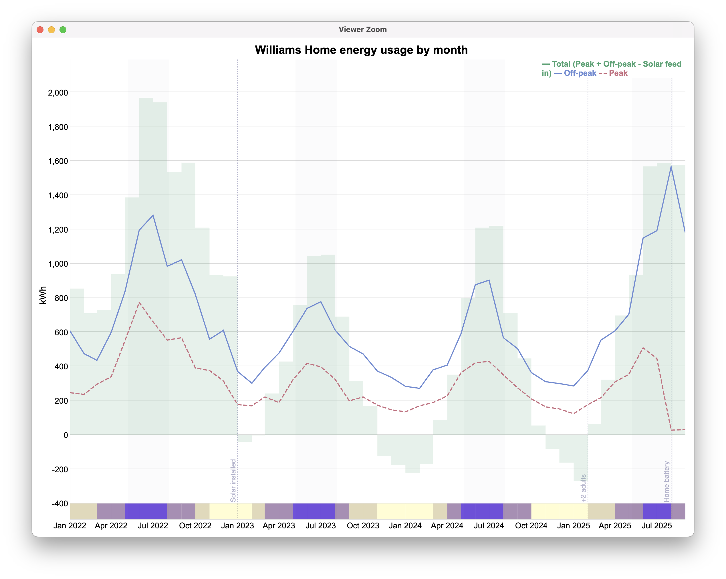
I then went a bit further and customised the chart, calculating & displaying a new field for total kWh for a month, and adding a “ribbon” of monthly solar exposure hot Hobart. The screenshot below shows some of the features of Dygraphs - annotations, series customisation, bands:
The full code - loading the CSV file, converting to a time series, and formatting the chart - is at https://github.com/thomasswilliams/r-solar-dygraph/blob/main/solar-analysis.R.
Happy charting! Download the files from the GitHub repo, substitute your own power usage numbers and run the R script to see the full impact of the interactive chart. Though it may be simpler to comment out the ribbon code - I added it for cosmetics, the hard-coded values are applicable to me here in Hobart, Australia :-)