Shiny - and R Markdown output to HTML - have a range of input controls available for data-driven interactive reports & dashboards: text, dropdowns, date, checkboxes, range sliders, and more.
I’ve got a few posts on R Markdown and a whole repo with tips and tricks at https://github.com/thomasswilliams/r-markdown-snippets. Here’s why I keep plugging R Markdown and Shiny: it’s a free, open-source language; using a declarative format (Markdown) with very little boilerplate; incorporating amazing third-party libraries for data analysis & display; that can be deployed using Docker; resulting in interactive, powerful, self-serve reporting. With a few lines of code I can display the results of SQL query in a paged, sortable table - or interactive chart. For a time-poor DBA, having a way to easily get data out is key.
In this post I go over some low-effort ways to improve controls to save space, offer missing functionality, and better help end users. See the file https://github.com/thomasswilliams/r-markdown-snippets/blob/main/improve-inputs-1.Rmd for the full source code in a ready-to-run R Markdown file (all you need is R and RStudio).
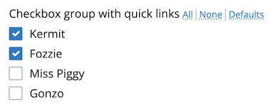
Shortcuts for checkbox groups
Thoughtful parameters can make complicated reports & dashboards simpler. Rendering R Markdown to a web page means you can use CSS and javascript enhancements, like I’ve done to enhance a group of checkboxes with jQuery to select/deselect items in a single click:
# R
shiny::checkboxGroupInput(
  "checkbox_group_input",
  # output HTML into the label
  label = htmltools::HTML("Checkbox group with quick links <a class='quick-link' id='checkbox_group_input_select_all'>All</a><span style='opacity:0.3'>|</span><a class='quick-link' id='checkbox_group_input_select_none'>None</a><span style='opacity:0.3'>|</span><a class='quick-link' id='checkbox_group_input_select_default'>Defaults</a>"),
  choices = c("Kermit", "Fozzie", "Miss Piggy", "Gonzo"),
  selected = c("Kermit", "Fozzie"),
  width = "400px"
)
/* CSS */
/* "select all"/"none"/"defaults" quick links for check box group */
.quick-link {
  /* smaller text */
  font-weight: normal;
  font-size: 0.8em;
  /* underline */
  text-decoration: underline dotted;
  /* style like other links */
  color: #007bc2;
  text-decoration-color: #007bc2dd;
  /* cursor */
  cursor: pointer;
}
// javascript
// "select all" quick link click
$(document).on("click", "#checkbox_group_input_select_all", function() {
  // check all options in the checkbox group
  $('#checkbox_group_input input[type="checkbox"]').prop('checked', true).trigger('change');
});
// "select none" quick link click
$(document).on("click", "#checkbox_group_input_select_none", function() {
  // uncheck all checkboxes
  $('#checkbox_group_input input[type="checkbox"]').prop('checked', false).trigger('change');
});
// "select defaults" quick link click
$(document).on("click", "#checkbox_group_input_select_default", function() {
  // uncheck all checkboxes
  $('#checkbox_group_input input[type="checkbox"]').prop('checked', false);
  // loop through all checkbox inputs
  $('#checkbox_group_input input[type="checkbox"]').filter(function() {
    // get the value of the checkbox
    var val = this.value;
    // return true if value matches with case-sensitive, hard-coded defaults
    return val == "Kermit" || val == "Fozzie";
  }).prop('checked', true).trigger('change');
});
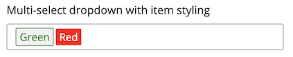
Multi-select dropdown vs. checkbox group
A multi-select dropdown may be preferable to a checkbox group, specially when vertical space is a premium. One consideration is losing a little visibility into available items with a multi-select dropdown. An enhancement for the multi-select dropdown is styling items - I use this technique to match color-coding in a report:
# R
# multi-select Selectize input, with colors thanks to custom CSS
# see CSS below
shiny::selectizeInput(
  "multi_selectize_input",
  label = "Multi-select dropdown with item styling",
  choices = c("Green", "Blue", "Red"),
  # defaults from YAML front-matter
  selected = params$default_colors,
  # allow multiple
  multiple = TRUE,
  # wider
  width = "400px"
)
/* CSS */
/* styles for multi-select Selectize input items
   need to match the "data-value" to case-sensitive choices in the input */
#multi_selectize_input + .shiny-input-select.multi div.item[data-value="Green"] {
  color: green;
  border: 1px solid green;
}
#multi_selectize_input + .shiny-input-select.multi div.item[data-value="Blue"] {
  color: blue;
  border: 1px solid blue;
}
#multi_selectize_input + .shiny-input-select.multi div.item[data-value="Red"] {
  background-color: red;
  /* white text for better contrast */
  color: white !important;
}
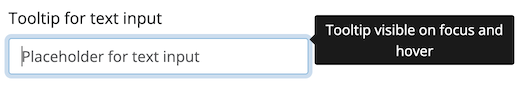
Tooltips and placeholder text
Placeholder text is great, but when there’s real text in the input, the placeholder is hidden. One approach I’ve utilised is tooltips from bslib - wrapping the control in a tooltip means the tooltip is visible when the user is typing, so can provide context-sensitive help:
# R
# text input surrounded by tooltip, tooltip will be visible on focus
# and hover; requires bslib
bslib::tooltip(
  # this is the original input
  shiny::textInput(
    "text_input",
    label = "Tooltip for text input",
    placeholder = "Placeholder for text input"
  ),
  # tooltip text
  "Tooltip visible on focus and hover",
  # tooltip position
  placement = "right"
)
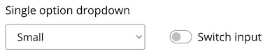
Columns vs. single line
Inputs in R Markdown can often take up a whole line. Here’s one method, using Pandoc fenced divs, that allows for columns to locate inputs next to each other:
<!-- a div with more colons, can contain one or more divs with less colons -->
:::: {.row}
<!-- Bootstrap styles -->
::: {.col-md-3}
```{r, echo = FALSE}
# create a normal dropdown (not Selectize)
# if no selected, defaults to first option - there is no "empty" option
shiny::selectInput("select_input", label = "Single option dropdown", choices = c("Small", "Medium", "Large"), selectize = FALSE, width = "200px")
```
:::
<!-- increase top padding to line up with input -->
::: {.col-md-9 style="margin-top: 38px;"}
```{r, echo = FALSE}
# bslib switch
bslib::input_switch("switch_input", label = "Switch input")
```
:::
::::
(See full docs at https://pkg.yihui.org/rmarkdown-cookbook/multi-column.)