This is my entry for the 2026 #30DayChartChallenge https://bsky.app/profile/30daychartchall.bsky.social; day 26 is all about trends.
I wanted to understand: when do trends change? So, based on a hunch and using Strava data, I fired up RStudio and set to work (Claude and ChatGPT helped with the code, especially the Strava API stuff).
The resulting R Markdown file and instructions are on GitHub, ready to plug in your Strava client ID and secret: https://github.com/thomasswilliams/r-strava-2026
TLDR: the R package “RegimeChange” provides detection of trend changes using a variety of approaches. I used the Pruned Exact Linear Time (PELT) default algorithm. Read on for the full story, or take a sneak peek at the chart, generated using Plotly (the red horizontal lines are the trend changes):
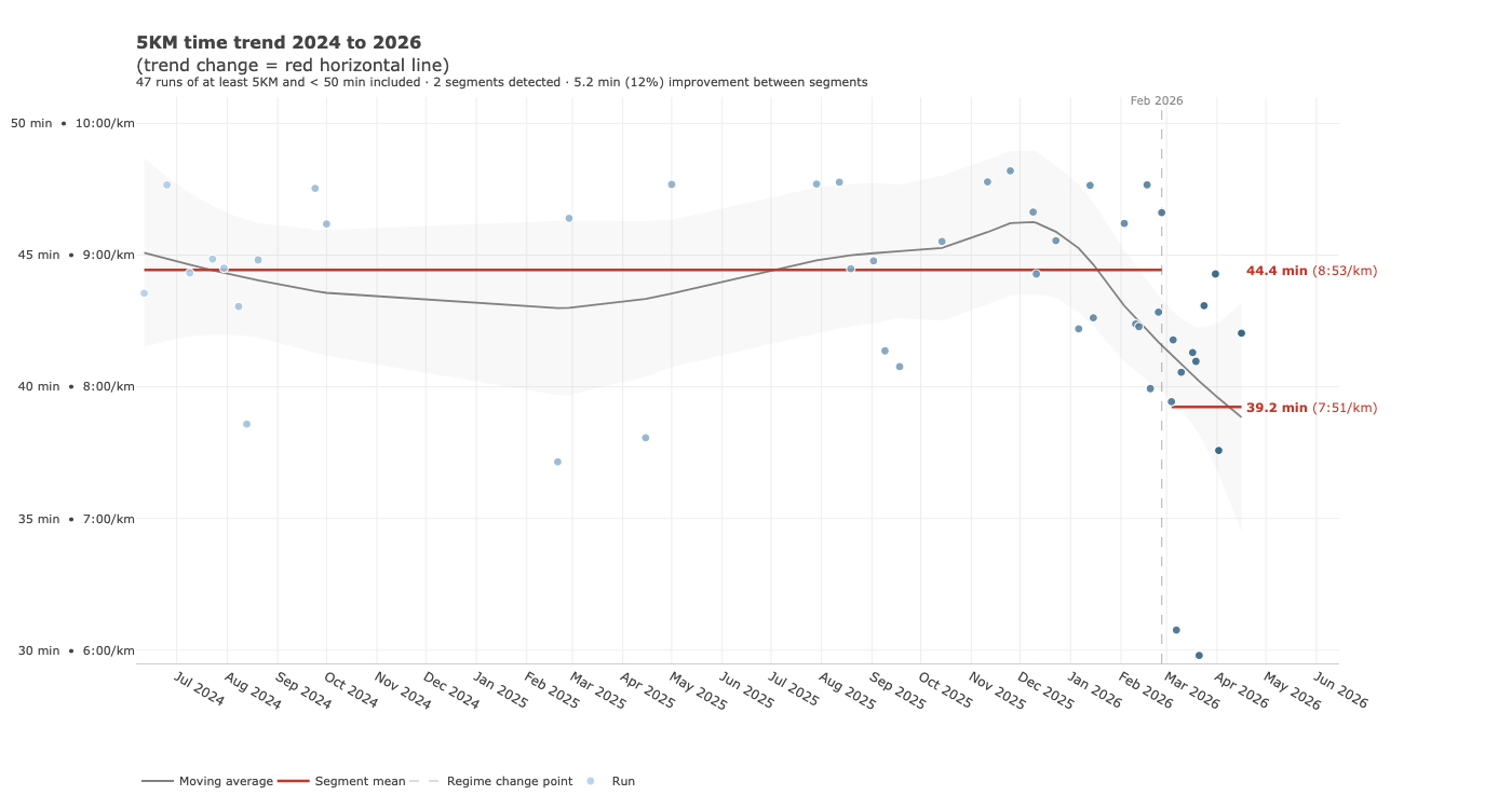
I don’t record all my runs in Strava, but runs over the last few months have felt faster and I hoped the data would reflect this. After a slow patch with an injury in mid-2025, I upped my running regularity to twice weekly (now, three times) and didn’t have much of a break during the Aussie summer in January 2026.
Back to the chart challenge: inspired by a Nicola Rennie post https://nrennie.rbind.io/blog/mapping-a-marathon-with-rstrava/index.html, my first step was gathering and filtering the data from the Strava API for the last 2 years. The 2-year timeframe should give enough data points to identify trends. I’m using just the first 5KMs of runs which are at least 5KM long, marked as a “run” in Strava, and have a 5KM time not slower than 50 minutes (e.g. faster than a walk). Variables are defined at the top of the code; to follow along (with RStudio and a Strava client ID and secret, easy to obtain even for free Strava users), open the R Markdown file in RStudio, install any missing libraries, enter your Strava client ID and secret on lines 54 and 55, then click Knit.
On the first knit you’ll be prompted to open a browser window and authenticate with Strava. Depending on your settings, the knitted HTML file will appear in RStudio’s viewer. It can then be opened in a web browser too.
I found the “RegimeChange” package simple to use and well documented, following the example from https://cran.r-project.org/web/packages/RegimeChange/vignettes/introduction.html, with the default algorithm. The raw analysis from detecting trend changes is included in the HTML output. In my case, two distinct trend “segments” were detected - a mean of 8 minutes, 53 seconds per KM up to March 2026, and a mean of 7:51 per KM since then. Exciting progress! And matches with how I thought my pace had potentially improved.
Over a few more iterations, I tidied up the chart, adding a moving average and tooltips, and also cached data from the Strava API to avoid hitting limits and speed up knitting (probably still needs work).
I had fun participating this year’s #30DayChartChallenge. I’m interested in how trend detection might work for other datasets. Hopefully others can use my code to detect trend changes in their own Strava data.